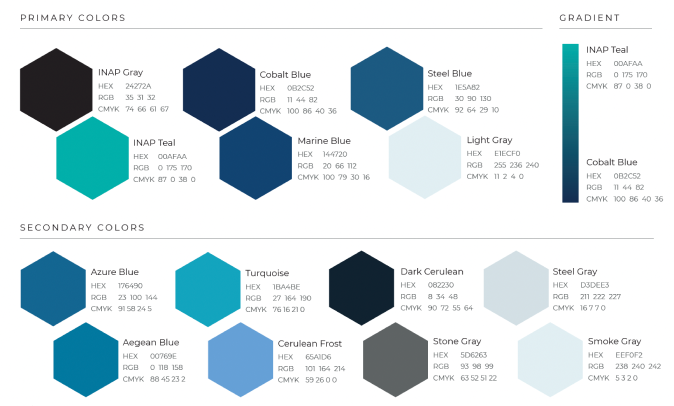
Color Palette
The first step in the redesign, I expanded the color palette with more colors.
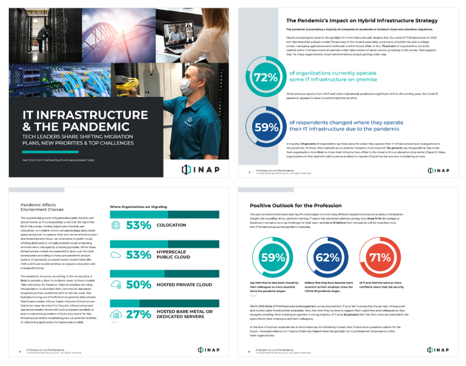
Brand Campaign + UI/UX Design + Graphic Design
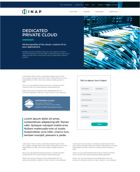
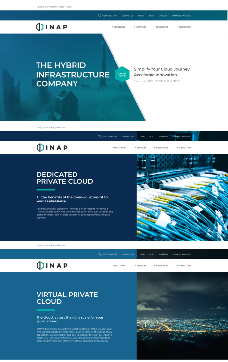
INAP asked me to redesign their entire website to focus on their new messaging and company direction. I only designed the site, I managed a third-party vendor to do the developing throughout the project. I met with them weekly to discuss milestones and make sure the development stayed on track and met the established due dates.
After going through INAP’s former website I noticed some issues that need to be addressed in the redesign.
The objectives for the website redesign were:
The first step in the redesign, I expanded the color palette with more colors.
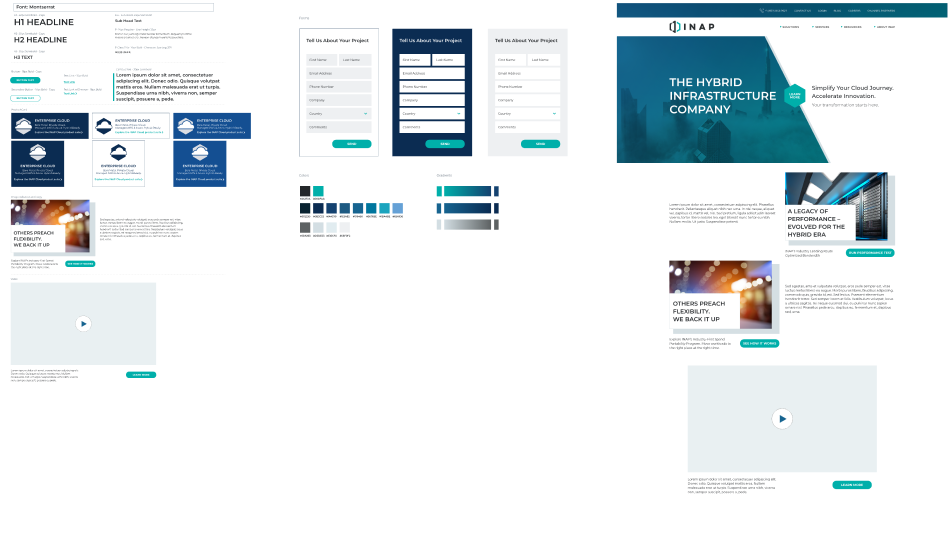
I created the design system and worked with the developers to create reusable components to speed up development time.
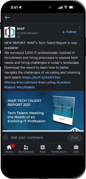
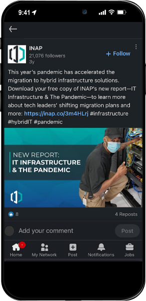
The sales team toured the data centers across the country and invited clients. I created posters to advertise, I used concert posters as inspiration.
I was given the raw footage to turn into a compelling video using transitions, music and title cards.
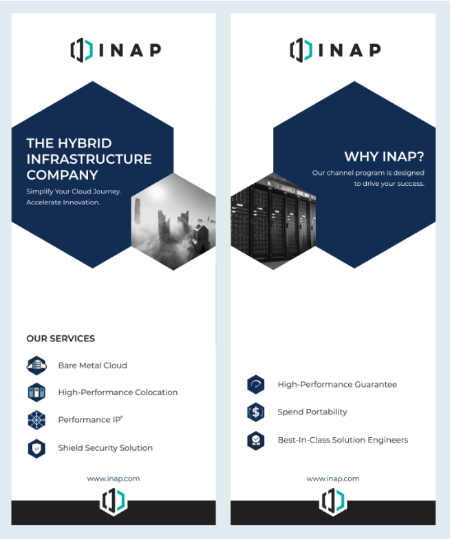
I designed and had these banners rptinted the same day in the same city as the trade show. The sales team mixed up some dates and forgot about this event so I had to work fast.
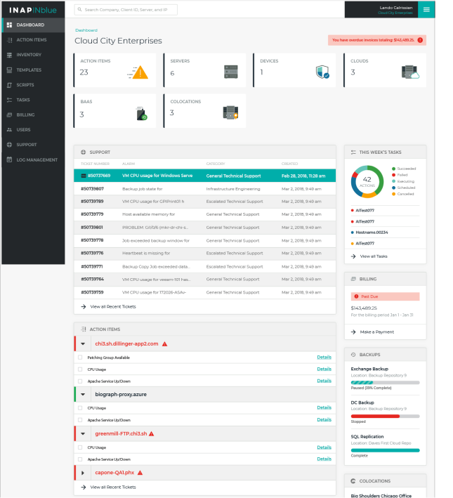
I redesigned the user interface for the INAP customer portal working with the user experience team to give clients a more intuitive experience. The previous version was different systems put together that clients had a hard time navigating. This project was a complete redesign to fix the portal and give it a cohesive look and feel.
INAP renamed their user portal to Atlas, I created the logo based off of the INAP logo.